
Layout Modes
Stacked category buttons versus the aligned panel sidebar, and the resource pack the panel layout needs.
DialogForge draws every menu one of two ways. Both read exactly the same menu file, so switching modes never means rewriting anything.
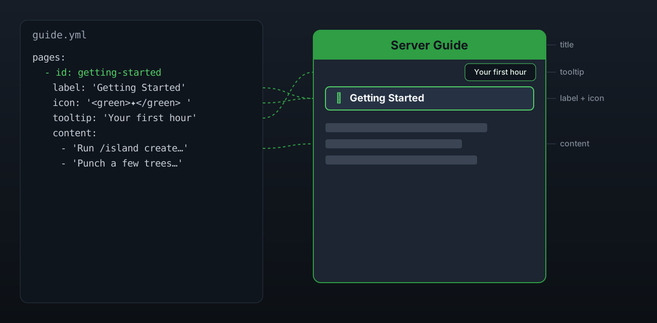
Stacked
The default, and it works on any Paper 1.21.7 server with no setup at all. Content renders as the dialog's body text, categories render as real dialog buttons in a grid below it, and the close button is the dialog's own exit action, so it lands in the footer.
layout:
  mode: stacked
  columns: 2
  button-width: 150
layout.columns is how many category buttons sit side by side, and layout.button-width
is how wide one button is in pixels. A menu file can override either with its own columns
key.
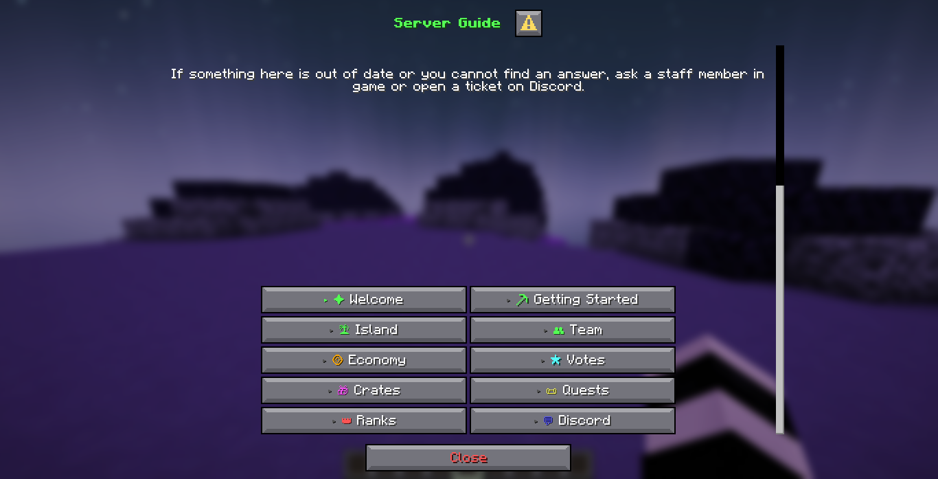
Panel
An optional layout that draws the categories and the content as text side by side, a sidebar column and a content column in one line per row. It needs a small resource pack DialogForge writes for you, because a dialog button cannot sit beside a paragraph and text is the only way to draw two columns at all.
layout:
  mode: panel
panel:
  aligned: true
Turn on panel.aligned once the pack is in place. Without it, the layout is a list of
categories above the content, which reads fine on any server and needs no pack at all.
The shipped faq.yml is already in this layout. It carries layout: panel at the top of
the file, which beats layout.mode for that one menu, so /faq is the screen to open
once the pack is served and panel.aligned is on. Until then it reads as the plain list.
Getting the pack to players
DialogForge writes plugins/DialogForge/pack/DialogForge-Panel.zip on every enable, and
prints its hash to the console. Get that font in front of players one of two ways:
Upload the zip somewhere your players can download it from, then fill in:
panel:
  resource-pack:
    send-on-join: true
    url: 'https://your-upload.example/DialogForge-Panel.zip'
    sha1: 'the hash DialogForge printed on startup'
    required: false
sha1 matters: a hash pinned here that no longer matches the zip just written is a warning
naming both, because a client caches a pack by its hash and a mismatch keeps the old pack on
a player's disk for good.
How the aligned panel lines up
A body element in a dialog spans the whole width and is centred on its own, so a category and the text beside it have to be one element holding both, and Minecraft centres that element by the exact pixel width of every glyph in it, summed in half pixels.
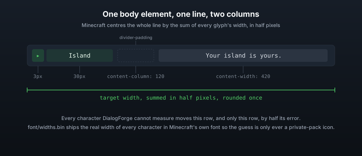
DialogForge ships the real width of every character in Minecraft's own font, so ASCII,
accents and the arrows in layout.active-marker are all known exactly. What is left to
guess at is a character your own resource pack draws, most often an icon at the front of a
category name. The console names those, once per menu on load, so you know which ones are
worth measuring.
The settings that shape the two columns
| Key | What it does |
|---|---|
panel.content-column | The earliest point the content column may start, a minimum rather than a fixed position |
panel.content-width | States the content column's width outright. 0 means whatever layout.body-width leaves over |
panel.lines-per-category | Lines of screen one category owns, 1 ties the columns together, 2 lets the text run past the sidebar |
panel.divider | Drawn between the columns on every line. Empty, the default, means spacing only |
panel.divider-padding | Gap kept clear on each side of the divider |
panel.shift | Nudges the whole panel sideways without changing the layout |
panel.icon-width | The real width of your resource pack's icons, when they are all the same size |
panel.glyph-width / panel.glyph-widths | The fallback and per character overrides for anything DialogForge cannot measure |
panel.content-width is the one to reach for when the text is coming out narrow: without
it, wide category names push the content column out and leave the text a strip a few words
wide. Both columns together are held under 1024 pixels, the most a dialog line may be, so a
number past that comes back at what fits.
panel.use-commands stays off unless clicks are not registering on your build. On,
clicking a category runs /dialogforge open instead of a silent client side click, and
the console logs every one of them.
Other layout settings
| Key | What it does |
|---|---|
layout.stable-height | Pads every page of a menu to the height of its tallest page, so the screen does not drop when the player changes category |
layout.min-lines | The fewest lines a page is drawn at, which is the only way to cover more of the darkened world behind the dialog |
layout.active-marker / layout.inactive-marker | Put in front of the open category and every other one, kept the same width on purpose |
layout.show-locked-pages | Show categories the player cannot open, greyed out |
layout.always-expand | Draw every subcategory branch all the time |
See Backgrounds and Icons for the two things that draw into this same resource pack.