Menus
Players browse their collections in three GUI menus. Layout is set in menus.yml; the
wording is set in the language files (see Layout versus text below).
The three menus
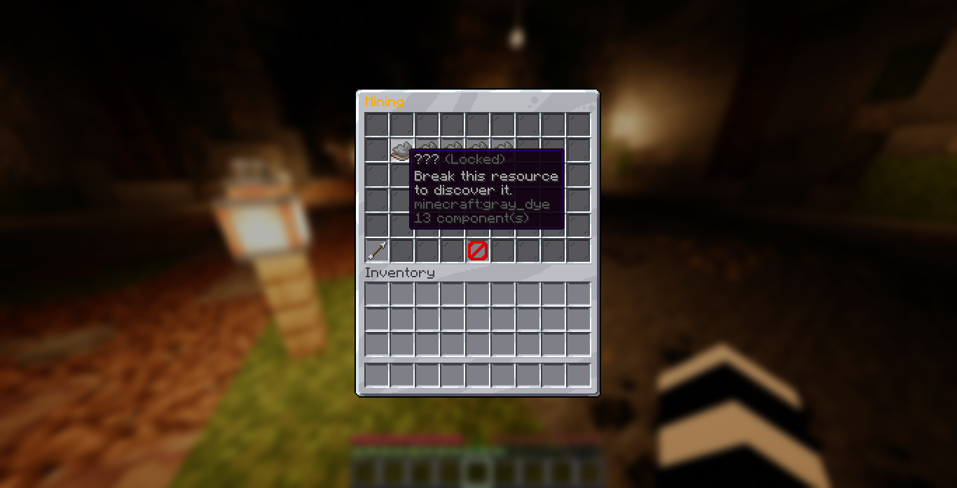
- Main menu lists every collection. It arranges them into the
content-slotsyou set and adds a second page automatically when they overflow. A collection set toinlineshows its resources here directly instead of a single icon. - Category menu opens when a player clicks a collection. It lists every resource in that collection, with pages if there are too many to fit.
- Resource menu opens when a player clicks a discovered resource. It shows every tier of that resource, its rewards, and your progress, and is where rewards are claimed.
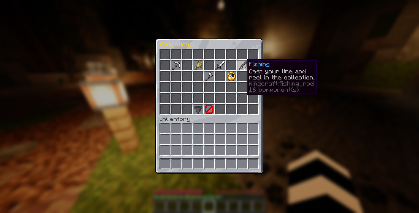
Locked resources show a hidden name and a hint. Discovered resources show progress, the current tier, and the next reward. See Progression for how those states work, and Tiers and Rewards for claiming.
Layout versus text
menus.yml controls layout only: which slots hold what, item materials, and how many
rows each menu has. All menu text (titles, button names, lore, tier labels) lives in the
language files under lang/, so it follows the language: setting and can be translated. To
change wording, edit the lang file; to move things around, edit menus.yml. See
Messages and Language.
Opening a menu
Players run /collection to open the main menu. See Commands.
Layout settings
Each menu is defined in menus.yml. You set the number of rows, the filler item, and where
the buttons and items go. The button names and menu titles come from the lang files.
Main menu
| Setting | What it controls |
|---|---|
rows | Menu height, 1 to 6 rows |
filler | The item shown in empty slots |
content-slots | The list of slots collections (or inline resources) are placed in, filled in order |
next-page and prev-page | The pagination buttons, shown only when entries overflow one page |
claim-all-button | The Claim All button, shown in claim reward mode |
close-button | The slot and item of the close button. Set enabled: false to hide it |
The main menu fills content-slots in order: one entry per collection, or one entry per
resource for a collection set to inline: true in
categories.yml. When the entries do not all fit, a Next Page
button appears; otherwise there are no page buttons. Give a collection a slot (and page) in
categories.yml to pin it to an exact spot instead of auto-filling;
an inline collection's resources can each take their own slot the same way.
Category menu
| Setting | What it controls |
|---|---|
rows | Menu height |
filler | The item shown in empty slots |
back-button | Returns to the main menu |
close-button | Closes the menu. Set enabled: false to hide it |
resource-slots | The list of slots resources are placed in, filled in order |
next-page and prev-page | The pagination buttons, used when resources overflow |
Resource menu
| Setting | What it controls |
|---|---|
rows | Menu height |
filler | The item shown in empty slots |
tier-slots | The list of slots tiers are placed in, lowest tier first |
tier | The item material for each tier state: locked, claimable, and claimed |
back-button | Returns to the previous menu: the category menu, or the main menu for an inline collection |
close-button | Closes the menu. Set enabled: false to hide it |
Slots are counted from 0 in the top-left, going left to right, top to bottom. A six-row menu has slots 0 to 53.
Example
main-menu:
  rows: 6
  filler:
    material: BLACK_STAINED_GLASS_PANE
    name: ' '
  content-slots: [10, 11, 12, 13, 14, 15, 16, 19, 20, 21, 22, 23, 24, 25]
  prev-page:
    slot: 45
    material: ARROW
  next-page:
    slot: 53
    material: ARROW
  claim-all-button:
    slot: 48
    material: HOPPER
  close-button:
    enabled: true
    slot: 49
    material: BARRIER

resource-menu:
  rows: 6
  tier-slots: [10, 11, 12, 13, 14, 15, 16, 19, 20, 21, 22, 23, 24, 25]
  tier:
    locked:
      material: GRAY_STAINED_GLASS_PANE
    claimable:
      material: LIME_STAINED_GLASS_PANE
    claimed:
      material: LIME_DYE
The wording (titles, button names, tier labels) is set in the language file, where colors
use the & code format, including hex colors like &#FFD700 and gradients. See
Colors for every code you can use.